8IT Dish Finder app


this is a complete redesign
This redesign began as a passion project to improve the usability, desirability, and aesthetic appeal of the current 8it app. I am not affiliated with the 8it design team in any capacity and my suggestions are based purely off the research I conducted on my own. I performed the UX Research and UI Design throughout this exciting journey….my first design sprint.
MY ROLE
I did the UX Research, Usability Testing and UI Design on this sprint
KEY GOAL
Improve the usability and desirability of the current 8it app
DELIVERABLES
User Research, Wireframes, Usability Testing, High Fidelity Screens, Prototype
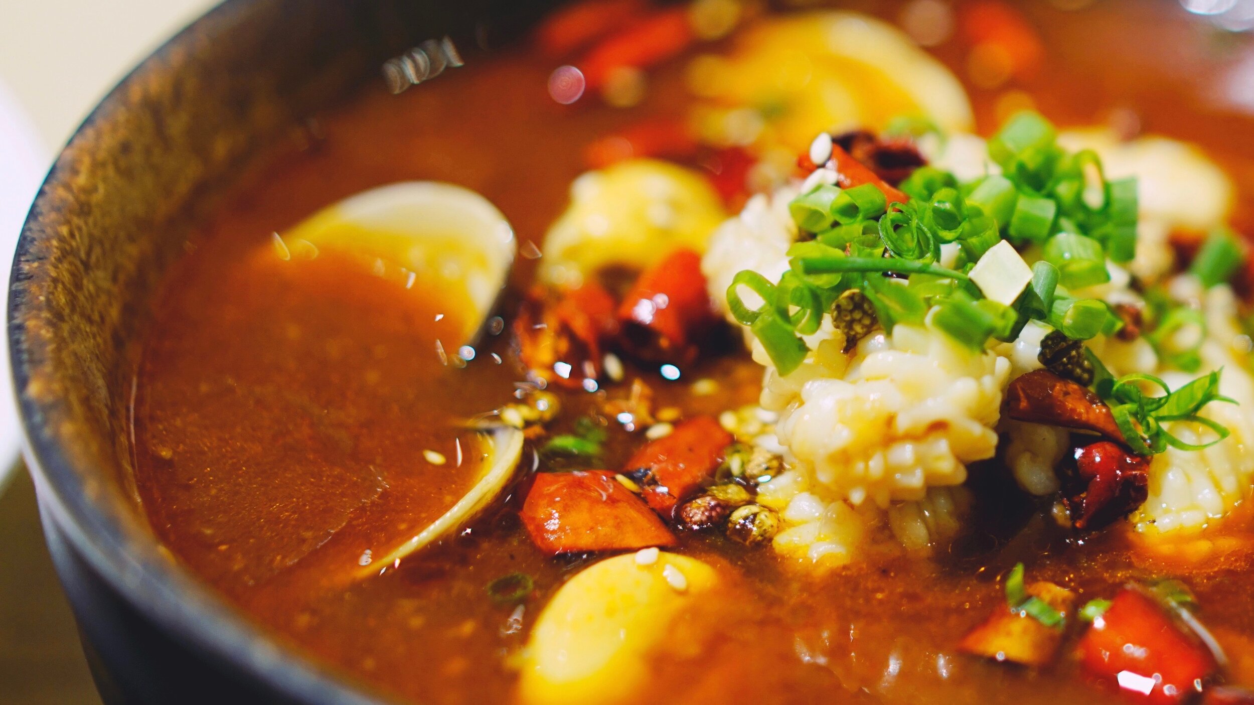
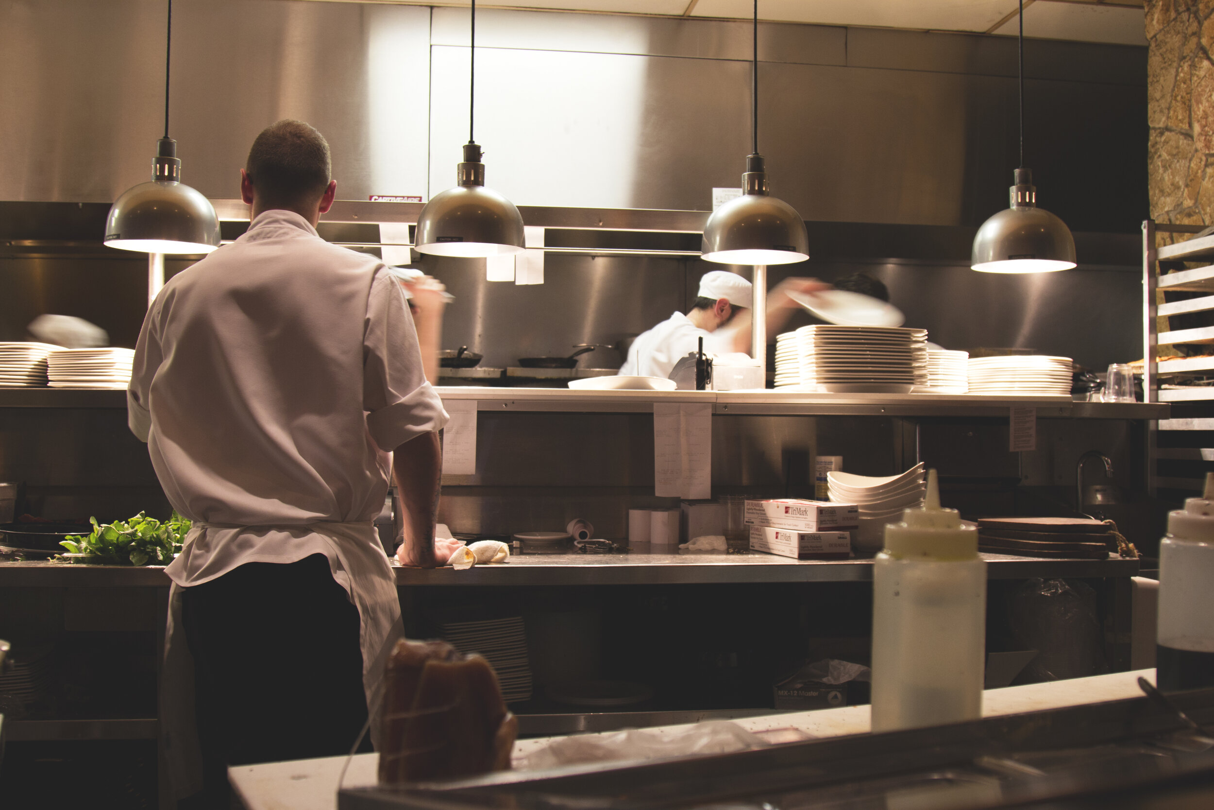
Who is 8it?
An up and coming startup that allows users to find the very best dishes in New York City. With a focus on providing reliable reviews from professional food critics, the app enables users to maneuver the busy streets and exciting locales to find that dish their taste buds had been waiting for.
Discover & Define
Research and usability testing was done to determine what the key issues were with the original app design

Users find the current design confusing to use
Usability testing was performed using the 8it app with 5 participants in order to better understand what needed improvement. Tests were done in person, and a test script was developed so that the results would remain as accurate as possible.
Users commented that some tasks that were asked of them were difficult to complete, either because of a lack of information or the hidden nature of some features and how to find them.

hard to discover new dishes
The vertical scrolling and many options without any visual representation to give context, hinders the discoverability of new dishes. The hamburger menu also hides important features from users and limits their ability to explore.

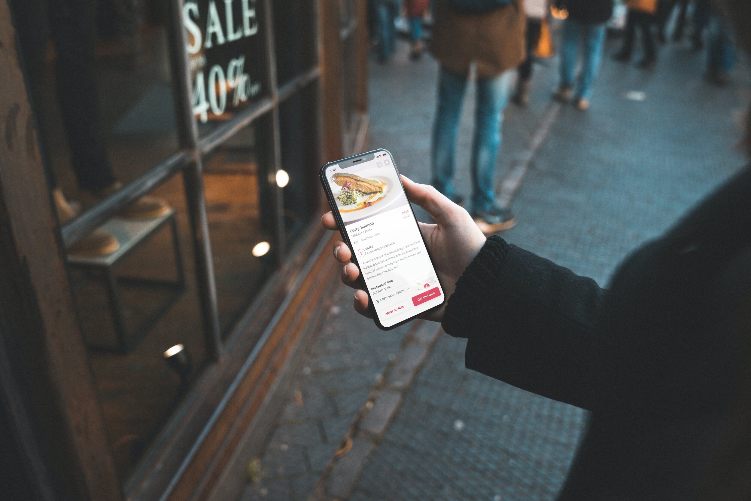
item screens aren’t helpful
Users are forced to make a decision on whether to get a dish based on a single photo and review. The absence of relevant information leaves users unsure and eventually leads to abandonment of the app.
develop & Deliver
With the most prominent issues being defined, I began ideating and designing potential solutions
People eat with their eyes
Based upon insights garnered from the usability tests that I conducted, users stated that what the dish looked like was the most important thing to them when they decide what kind of food they want, followed by price and distance. With this in mind, inspiration was drawn from content sharing apps such as Pinterest, Instagram, and Youtube for their extraordinary ability to present content in a visually prominent way without making the interface feel too busy.
With a style guide created based off the original 8it design and keeping users as the primary focus, I began piecing together the UI elements and features that would improve the usability of the app, striving to create a sense of hierarchy in order to make it easier for users to explore the interface and find the food they’re looking for.
Enabling users to discover new food
Users found the vertical scrolling wheel of the current app to be more “gimmicky” than helpful. With such a large catalog of food categories present on the app, there was a slight challenge on how to make it all easily discoverable and not take up too much space. By adding a button that expanded once pressed, I was able to present the categories with one quick interaction, a feature I believe would improve the discoverability of new categories better than horizontal scrolling (many options are still hidden when confined to scrolling left to right).
giving users what they need to make a decision
Information on the dish was scarce and users commented that they didn’t feel comfortable trying new dishes without any context. I opted to make the food the most prominent item on the screen and provide only the most immediate information on the “Explore” page (dish name, restaurant, price, and location). Once users tap on a specific dish. they are presented with the dish info page which they can use to find all the information they need to make a decision. A prominent “Get this Dish” Call to Action button is present so users are aware of what actions can be taken.

Explore/home
Explore new food categories or find out what amazing dishes are close by

map
Get a birds eye view of the best dishes NYC has to offer and where you can find them

dish info
Find all the information you need on the dish and restaurant so you can try new foods confidently

search & filter
Useful search hints and an in depth filter to help narrow down results to your specific needs

Saved dishes
Find all your favorite dishes in one place so you’re never stuck searching endlessly for the one that got away

user profile
Access your account information in one convenient location


Finding the right dish was easy as 1…2..3
I tested the prototype with the help of 5 participants, using a script to keep the assessment consistent between testers
What I learned
Users were able to easily navigate through the interface
Users found the “expanding categories” button convenient
5
Users Tested
5/5
users would use this app to find delicious food
4/5
Users completed all tasks
looking back
This sprint was my first step into UX/UI design and really pushed me in my aspiration to make beautiful and useful interfaces. I was able to practice researching and making informed design decisions throughout the whole process, sharpening my critical thinking skills. In the future I plan to test this design with current 8it users, taking the time to explore whether the features I added would be a meaningful improvement to the current way users find the best dishes in New York City.

Like what you see?

8IT DISH REVIEW APP