
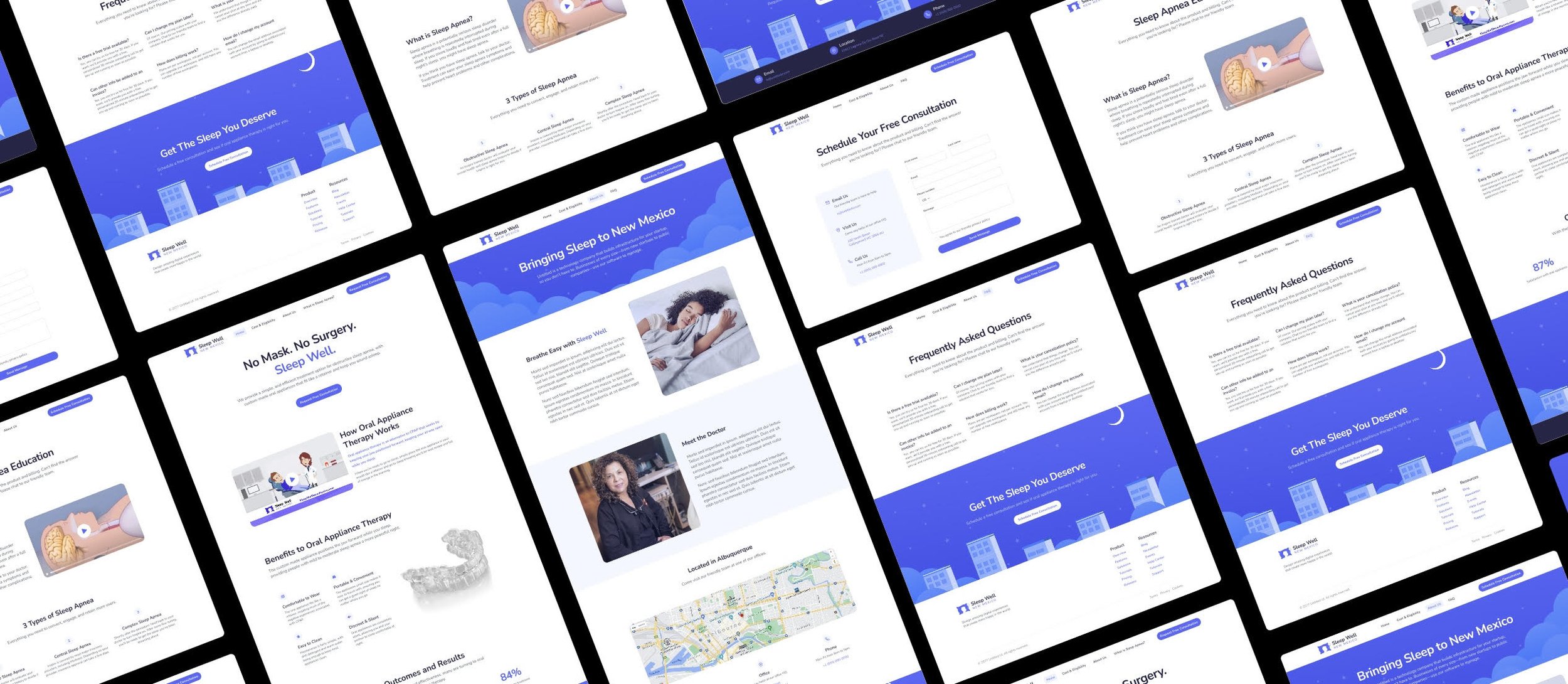
Sleep Well new Mexico website
“Bringing Sleep to New Mexico”
Team : Joshua Jaime
Duration : 4 Months
PROJECT OVERVIEW
This is the journey of Sleep Well’s website. I will cover major design decisions made over the past 4 months, as well as what hurdles we had to overcome and our solutions.
MY CONTRIBUTIONS
Throughout this process I lead the research, design of wireframes, prototypes, the high fidelity deliverables, usability testing, and the final coded website.
Starting from scratch
I joined Sleep Well as its only designer in late 2021. There were only three of us, the doctor, the receptionist, and me (the designer). The oral appliances we provided for sleep apnea were custom fit in a small building we shared with the nearby dental practice. Our circumstances may not have seemed ideal but we were passionate. Our brand had a logo, a mission statement, and a solid flow of referrals from the neighboring dental practice….but we wanted more.

Sleep Well Brand
— DECEMBER 2021
When I joined the company, Sleep Well was receiving all their patients by referrals from the nearby dental practice. The amount of patients was enough to keep the business afloat, however not quite enough to enable the company to grow. Sleep Well had no online presence and no exposure, limiting their ability to acquire new patients. My job was to change that.
I spent the next month learning as much as I could about sleep apnea and the challenges people faced with the disorder are prone to. It became rather difficult setting up interviews with Sleep Well’s current patients so I consulted subject matter experts, utilized studies published online, forums, and competitor websites to formulate my understanding of the problem before diving into the design.


The problem
people find cpap therapy uncomfortable & painful
Following my research, I learned that despite CPAP being the most commonly used form of treatment for obstructive sleep apnea, it was also the most uncomfortable for patients to use. I found that users want to wake up energized and well rested in the morning but many were not experiencing that type of success with CPAP devices because they would remove it during the night, or not wear it at all because of their poor experience with it.
Competitor websites are text heavy & generic
I conducted an evaluation on the top three offices in New Mexico who were also offering a CPAP therapy alternative. Many of these competitor websites utilized complex jargon and required the user to dig through the layout in order to gain an understanding of their value proposition. With this information, I aimed to create a website for Sleep Well that addressed these issues and stood out from the crowd.

Competitor Websites
sleep well needed an easy to scan website with a strong value proposition
Mothers are expected to log their info many times a day while making changes to their diet and lifestyle, a tedious and intimidating task. What we needed to do was enable women to regain control over their health and empower them to beat their diagnosis.

— JANUARY 2022
When I joined the company, Sleep Well was receiving all their patients from referrals by the nearby dental practice. The amount of patients was enough to keep the business afloat, however not quite enough to enable the company to grow. Sleep Well had no online presence and no exposure, limiting their ability to acquire new patients. My job was to change that.
Defining the scope
As a freelance designer, being able to define the scope of a project is important to ensure expectations are in alignment and goals are met. I began this collaboration with a meeting with the Sleep Well team, during which I learned their specific needs and provided them a time estimate for when their project would be complete. Once we were all in agreement, the real fun began, starting with research into their target audience.
exploring solutions
We conducted several design studio sessions on Mural, ideating rapidly as we narrowed down the scope of our features through every iteration.

usability testing
Important iterations & feedback
After quickly expanding upon our initial features, I constructed a medium fidelity prototype to test with users and receive actionable feedback before diving into the final high fidelity screens.

home page
Observation
Users found the “timeline” helpful in order to understand where they were in the day but stated that they felt overwhelmed and were unsure of what the information at the top of the screen meant.
solution
The “timeline” on the screen was condensed and converted into a card format in order to remove the clutter and further ensure users are aware of what step they are on at the moment, while being sure to provide an intuitive section at the top indicating user progression.
ABout page
Observation
Users found the “timeline” helpful in order to understand where they were in the day but stated that they felt overwhelmed and were unsure of what the information at the top of the screen meant.
solution
The “timeline” on the screen was condensed and converted into a card format in order to remove the clutter and further ensure users are aware of what step they are on at the moment, while being sure to provide an intuitive section at the top indicating user progression.

Colors & styles
As the fidelity of our wireframes increased, I developed the style guide necessary for maintaining a consistent feel between screens.
A soft and friendly color palette
A monochromatic color scheme was chosen for the interface in order to maintain a simplistic and minimalistic feel to the interface. The main color (Pinkish Orange) was chosen because of its warm and friendly nature. The text color was infused with a slight tint of the main color as well in order to provide that same warm touch.


a rounded typeface for a more inviting interface
Nunito was chosen for its rounded edges and soft feel. The typeface containing plenty of differing weights, which enabled us to utilize it as the sole font on the interface, while providing enough contrast between text types.
maintaining a consistent style
The cards utilized within the interface were all designed with rounded corners in order to consistently match with the rounded edges of the typeface utilized, while bringing together all aspects of the mobile app to create a cohesive feel.

Designing the mobile experience
After many iterations, we designed a mobile app with a minimal appearance that offered mothers quick and easy to understand call to actions for an intuitive and easy to navigate application.

The final solution
After many iterations, we designed a mobile app with a minimal appearance that offered mothers quick and easy to understand call to actions for an intuitive and easy to navigate application.
Reshaping diabetes management
Providing Quick logging
Mothers were finding the process of searching for foods and logging them to be tedious and unmotivating. We implemented a Food Recocgnition capability in order to increase the speed by which users log their food info. This would enable mothers to quickly and effortlessly log their food for the day and remove the stress and intimidation experienced.
facilitating healthy diet changes
One of the key issues arose out of a lack of understanding on how to manage their carb intake and take care of their health. By offering meals recommended specifically and presenting video tutorials for recipes, we plan to alleviate any anxiety and confusion arising from having to make dietary changes.
Supporting Expecting moms
Care teams often did not show mothers enough attention, making them feel alone and ignored. With the integration of a smart chatbot, we aspire to provide quick feedback to mothers in order to reduce any feelings of loneliness or isolation during their pregnancy.
Home
Mothers can access the most important information from the home page, with a simple interface that allows quick recognition of tasks and progress.
presenting progress visually
A circular graph was used in order to visually present the progress mothers were making throughout the day as they logged their food and glucose readings, motivating consistent usage as they aspire to fill up the circles.
One bite at a time
A stack of cards detailing the tasks left for the mother to complete was chosen in order to reduce the amount of visual clutter on the screen, while allowing users to immediately know what task was up next. The goal was to reduce the overwhelming task of logging 10 times a day into much more manageable pieces.
Meal logging
These screens were designed with ease of use and quick interactions in mind, ensuring a busy mother can log her information easily and efficiently.
Quick ADD
An expanding circle was utilized for the quick add action to present the desired correlation between main categories and subcategories as the user begins the logging process, in order to prevent any backtracking or confusion midway through the process.
expediting the process
In order to expedite the process of logging food, we implemented a Food Recognition capability that works by taking a picture of the food item. The A.I. facilitating this interaction being capable of learning to recognize even ambiguous food items more and more consistently as the user logs more often.
Providing feedback
Quick feedback is provided throughout the interface in order to reduce any anxiety and uncertainty that may be accompanied with completing an action and being unsure of what happens next.
Healthy recipes
Providing access to healthy recipes specifically curated to users based upon their dietary preferences and the foods they consistently log, allow us to offer mothers a custom and unique selection of recipes that empowers women to make healthy decisions.
Using a checklist to ensure proper preparation
Utilizing a checklist allows mothers to prepare for a recipe and ensure they have all the ingredients to continue before making the commitment to begin cooking, reducing frustration that may occur because of missing ingredients.
utilizing simple tutorials to provide a much less intimidating experience
Quick video tutorials accompany each recipe in order to guide and direct users on how to prepare each meal, ensuring that confusion and intimidation is kept to a minimum when mothers are making their healthy choices.
statistics
User data is stored and presented in a minimalist format, ready to go for when the report is sent to their care team.
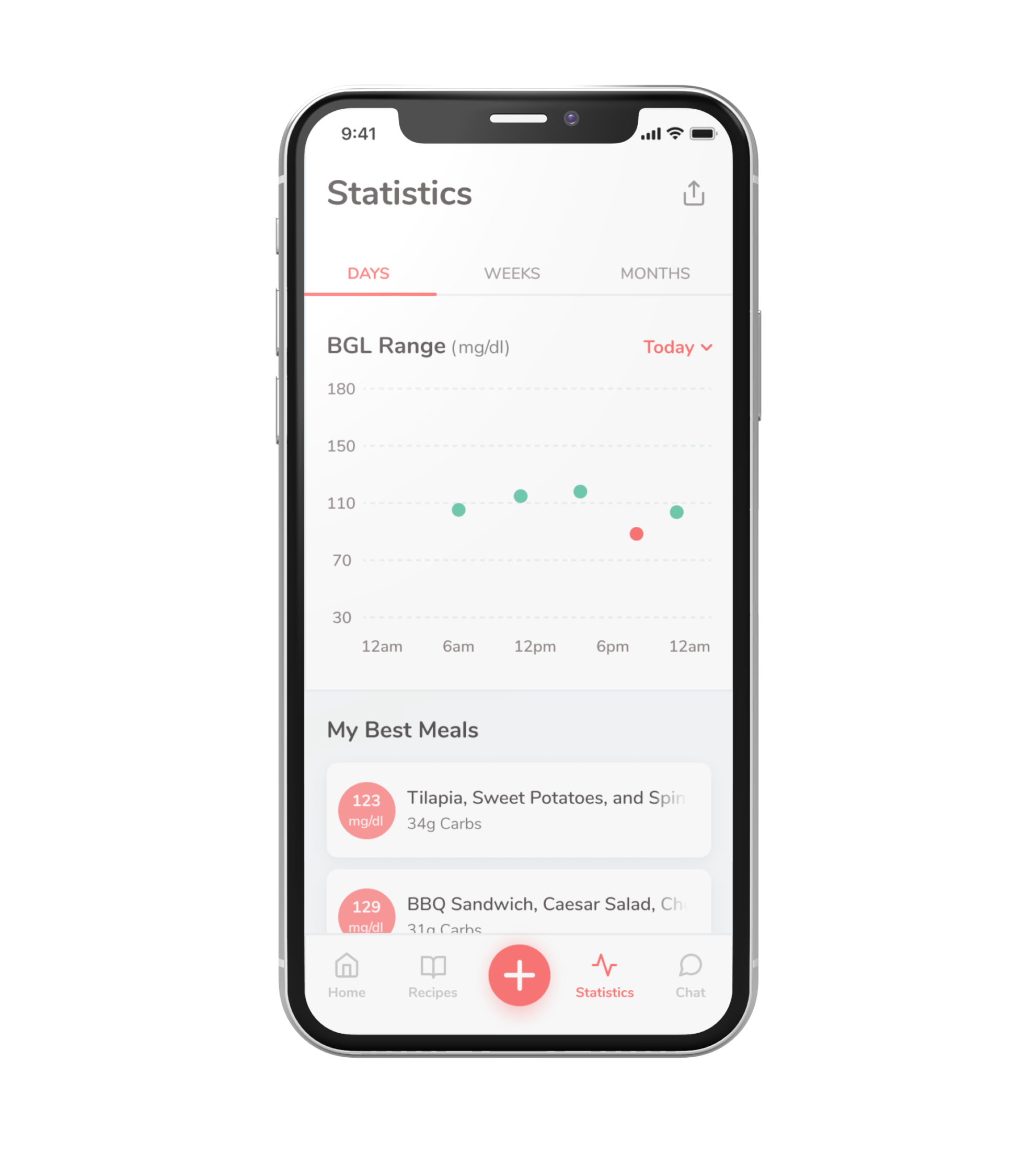
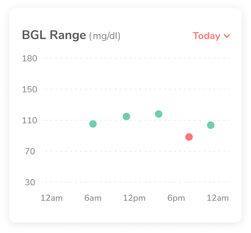
Quick and easy recognition of trends
Color coding is utilized to present data points where Blood Glucose Levels (BGL) are within the normal range, as well as outside that range, in order to allow users a quick understanding of how their meals are impacting their BGL.
presenting the Best meals
The best meals are shown accompanied with the reading from the correlating Blood Glucose Levels (BGL) so that mothers can quickly gauge which meals are most successful in maintaining their BGL within the appropriate range.


chatbot
Designed to bridge the gap between mothers and their care team, the chatbot can provide feedback and information to the mother when reaching the care team isn’t necessary, and informing the user when reaching a care team is necessary. Reducing the strain on already burdened care facilities and ensuring that mothers are able to receive quick feedback on less critical situations.
quick answers to important questions
Mothers receive quick feedback to their questions through an A.I. chatbot that asks guided questions in order to more appropriately and successfully gain context into the mothers inquiries before providing an appropriate answer.

Users pointed out that the amount of icons used when adding an entry is confusing
After producing the prototype, we tested the MVP with 3 participants who had experience going through a pregnancy with Gestational Diabetes (GDM).
What we learned
Users found the “logging” flow simple and easy to understand
Users found the minimalistic style of the app to portray a warm and inviting feel
Users were confused about the icons on the “add” button wheel, stating that they felt there were too many options
3
Users Tested
100%
completed tasks
3/3
Would use app to Log their info
Key screens

Just Peachy Mobile App
Reflection
This month long design sprint offered me the opportunity to further improve my ability to collaborate with other designers and justify design decisions. In the future we plan to reiterate on the “add” button, in order to provide a more intuitive and less overwhelming experience for busy mothers needing to log their daily tasks.
